By clicking the Send button, you agree to our Terms of Use and have read our Privacy Policy
[ phone number ]
[ e-mail ]
[ your name ]
Contact us to expand your business online!
hey there!
Сообщение об успешной отправке!
belavtodor
DESIGN & WEB-DEV PROJECT // COMPANY WEBSITE


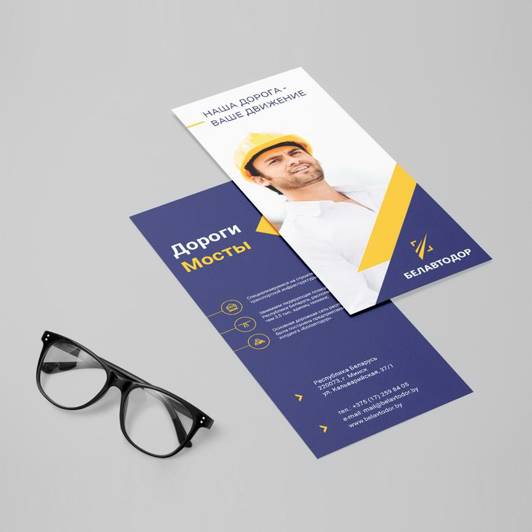
POS MATERIALS
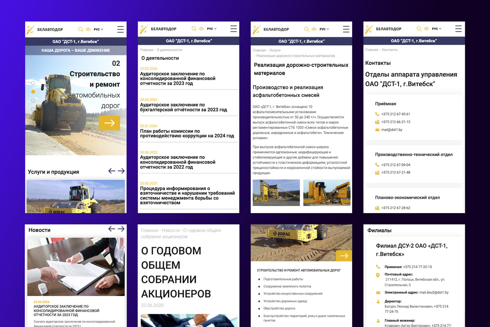
Our team, together with the departments of Belavtodor, dived in detail and analyzed the directions of the company's activity in order to develop individual pages for each of the services provided.
When developing the design concept, we emphasized strictness and minimalism. We designed a simple and clear navigation for easy information retrieval. We used light, neutral colors and corporate shades of blue to create a clean, professional image. Clear minimalist fonts with touches of brutalism to ensure good readability and emphasize character.
WHAT WAS DONE
Also, the new POS materials are significantly superior in quality and design to the previous ones. The new style fits perfectly into the concept of the company, and also perfectly emphasizes the direction of the company's services and its style.
Extensive experience in the development of complex structural systems allowed us to quickly and qualitatively develop a corporate website that was able to emphasize and preserve the corporate style of a large holding company, fully disclose the scale of the client's activities, increase the informativeness of the new site and improve usability.
THE RESULT
SEE HOW THE WEBSITE WORKS
-
WHAT CLIENT NEEDED
1/ Availability of a version for the visually impaired, two language versions - Russian, Belarusian.
2/ Improvement of usability and formation of a positive and modern image of the company.
3/ Disclosure of information about all areas of the company's activities and assortment.
4/ Logo, brand book & POS-materials design development.
2/ Improvement of usability and formation of a positive and modern image of the company.
3/ Disclosure of information about all areas of the company's activities and assortment.
4/ Logo, brand book & POS-materials design development.
INDUSTRY |
Construction
TYPE OF WEBSITE |
Corporate website
RELEASE YEAR |
2022
COUNTRY |
Belarus
BUILT WITH |
WordPress, PHP, JS
PROJECT INCLUDED |
Information gathering and planning
Design development
Adaptive layout
CMS development
Content writing & filling
Coprorate website for Belavtodor Holding - a group of construction and industrial companies in Belarus, which holds leading positions in the market of complex construction, reconstruction and overhaul of transportation infrastructure facilities.
Belavtodor
-


