By clicking the Send button, you agree to our Terms of Use and have read our Privacy Policy
[ phone number ]
[ e-mail ]
[ your name ]
Contact us to expand your business online!
hey there!
Сообщение об успешной отправке!
nvs
DESIGN & WEB-DEV PROJECT // SERVICE WEBSITE


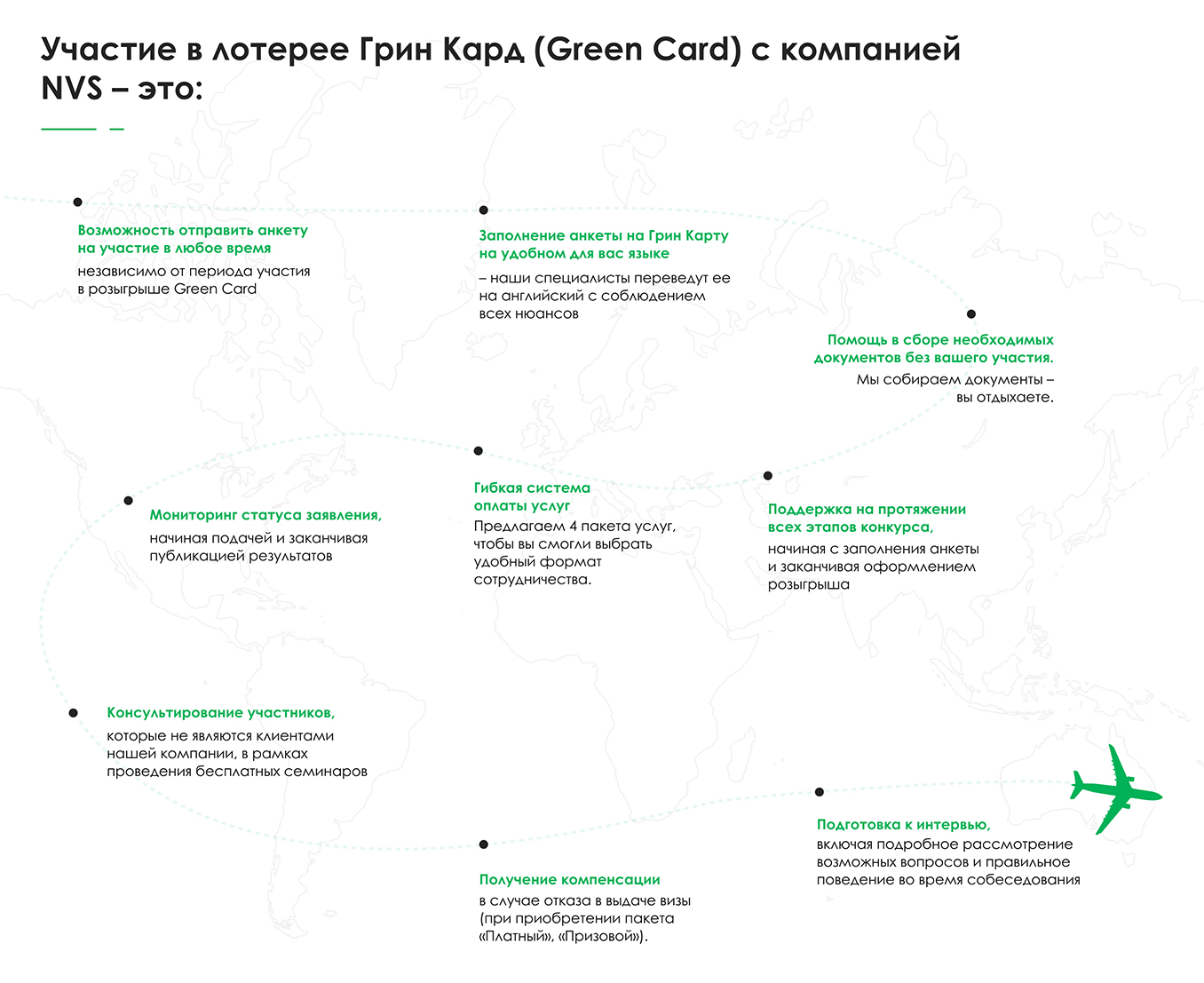
The USP was collected in on image to let people understand what they get when they decide to work with the company.

SEE HOW IT WORKS

-
THE PROCESS
Branded green color was used only as an accent. It was decided to choose black and white as the main colors. Only one kind of font was chosen for headings and main text, in order not to overload the composition, as the site consists of non-standard blocks and a large number of images.
The original site was more than 10 years old, and all we could take from it were texts, because there was no structure at all. So we had to think and rethink the user journey, so that every potential client would quickly find the necessary info.
The original site was more than 10 years old, and all we could take from it were texts, because there was no structure at all. So we had to think and rethink the user journey, so that every potential client would quickly find the necessary info.
THE RESULT
The new website now looks modern and user-friendly. We didn't follow any trends in creating this design, so we are safe to say that even in 10 years it will still be well-made, aesthetically pleasing, and trustworthy.
WHAT CLIENT NEEDED
The previous website had long been outdated. The client decided to order the development of a new website, which would stand out from the competition, as well as it could clearly show the company's services and allow to quickly find the necessary info.
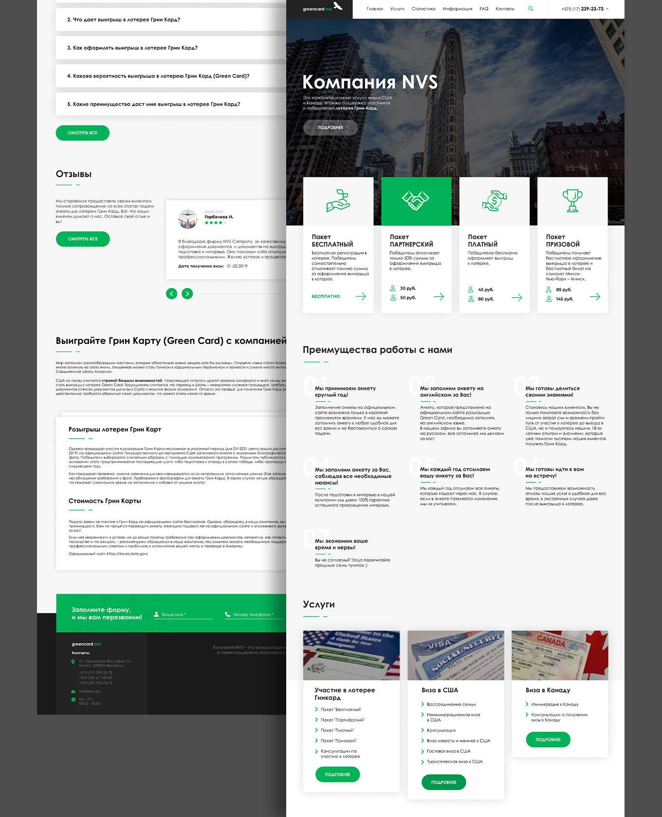
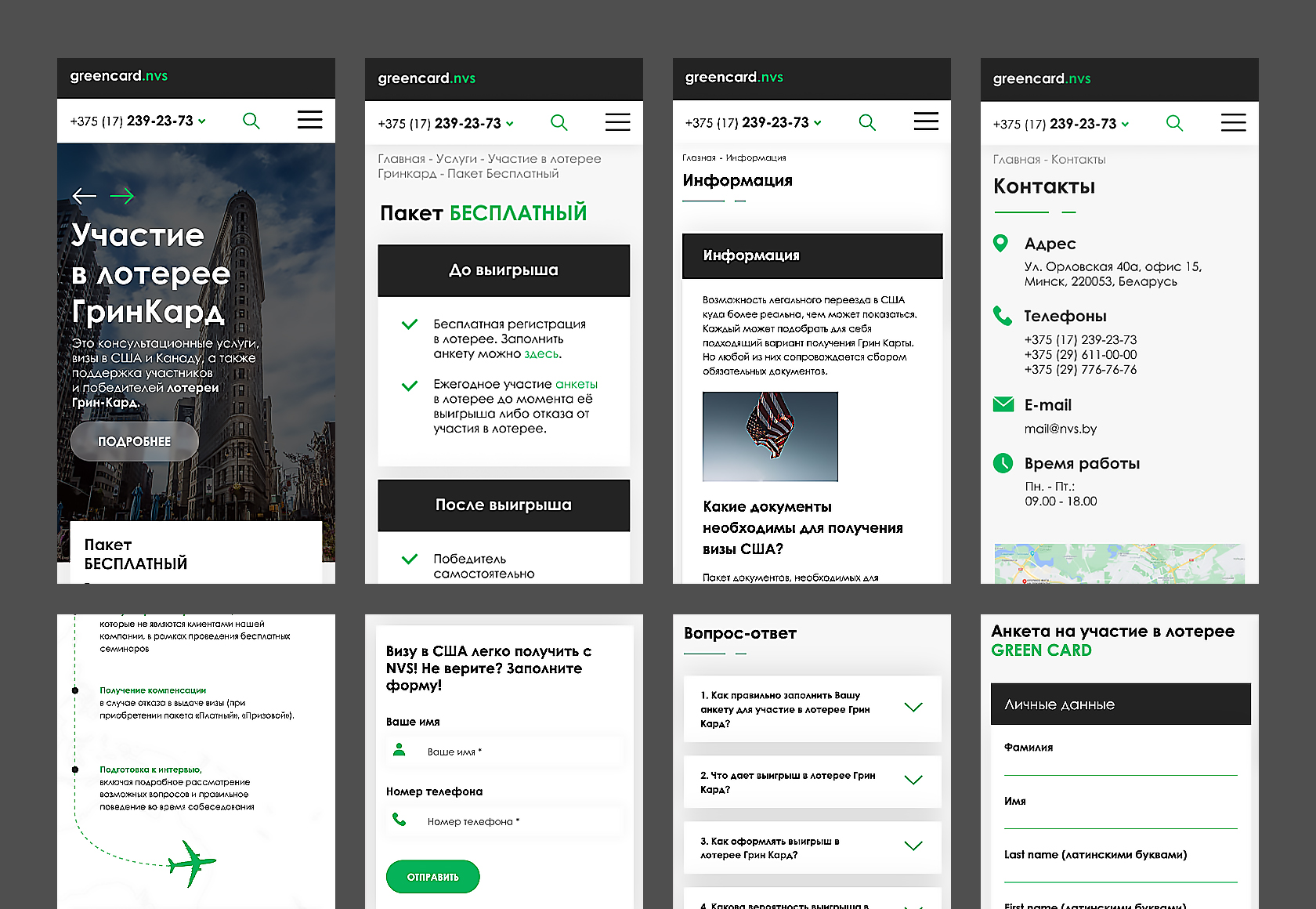
We developed a new website that is easy to use, visually appealing, structured, adaptive and has a responsive design. Much attention was paid to the usability of the site. The product catalog is elaborated, on the main page of the site there is an airplane and its way to show the steps people need to make to apply for a green card & USP.
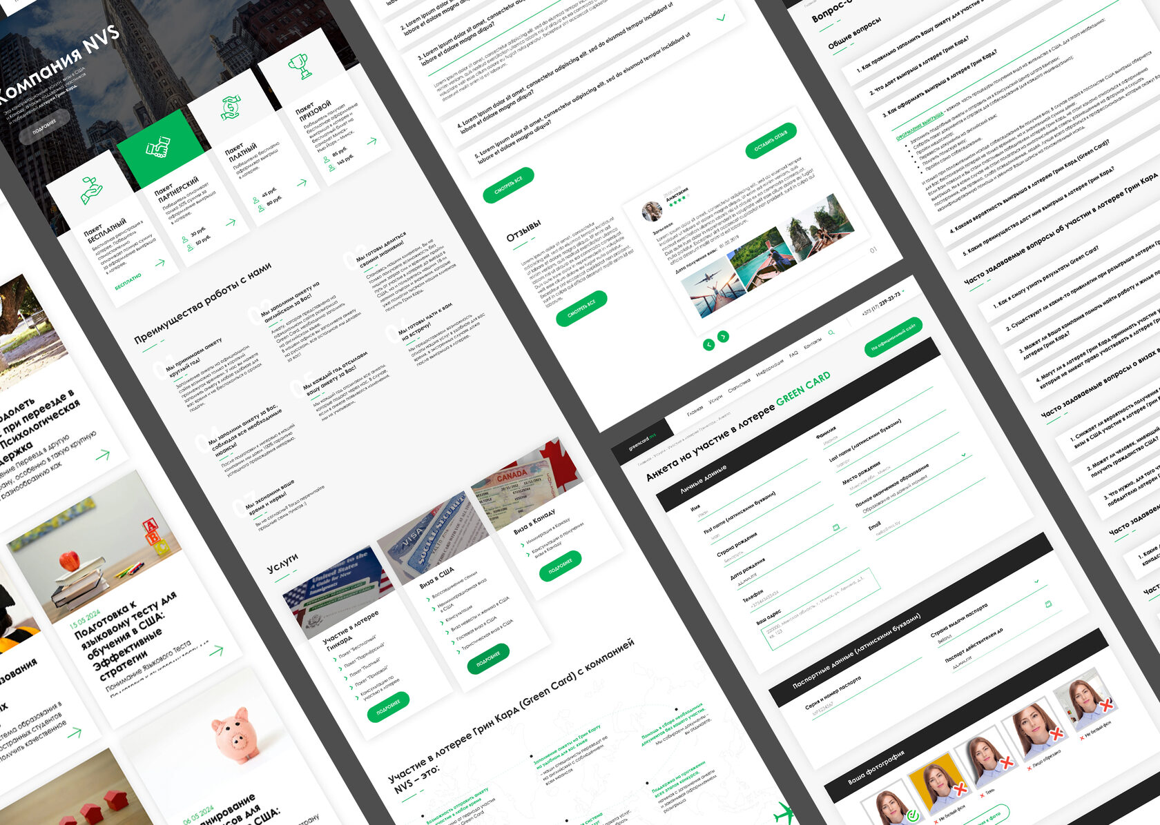
Each page has a unique design made in the general design system of the site.
Each page has a unique design made in the general design system of the site.
WHAT WAS DONE
INDUSTRY |
Green Card lottery
TYPE OF WEBSITE |
Service website
RELEASE YEAR |
2021
COUNTRY |
Belarus
BUILT WITH |
WordPress, PHP, JS
PROJECT INCLUDED |
Information gathering and planning
Design development
Adaptive layout
CMS development
Content writing & filling
SEO-optimization
Website redesign for NVS GreenCard which provides US & Canada visas assistance and Green Card services.
Take a look at how an old website looked like - click here.
NVS
-


